If you've been following my blog, you have probably noticed that I tend to go just a tiny, little bit bananas over interior styling. And it's been a while since I posted anything about it, right? That's because I've been searching not only for a styling that impresses with the pretty props but also for a unique concept and something that stands out of the crowd. This is what I found. Have a look!
Styled by Femke Pastijn and Shot by Dana van Leeuwen for 101 Woonideeën magazine the pictures represent the 'secondhand' concept. I have to admit as soon as I saw it I knew it was exactly what I've been looking for. Everything here is styled so uniquely and perfectly with all the details placed just in the right places. So what do you think about it? Do you like original styling or would you rather go for the standard one?
Great, right? I love the miniature furnitures in the photos and the pops of neon!
By the way have you seen the tiny sets of furniture in Ikea? They've been released in august 2013 but I just recently saw them and I think they are adorable... don't you think?


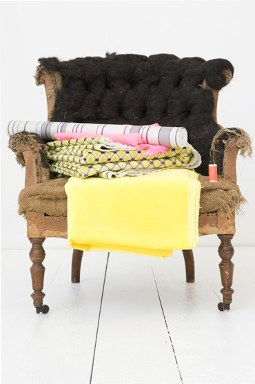
It's an interesting styling photo shoot! And I love it, but my favourite picture must be the old weathered chair with the different coloured textiles - it makes the photo more bright and fun to watch (but hey, I love colours... LOL!)!
ReplyDeleteInge x
They all look pretty! My favorite's the first picture.. the walls blend right into the floor and even though it might feel a bit clinical, or like a padded cell, it's also strangely calming. I think it would also work well with pops of neon/color on the furniture. Or washi tape would work too on the walls and edges of tables/shelves..
ReplyDelete